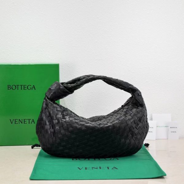
But then, thinking about it… maybe not *entirely* logo-free, but subtly logo-free. Like, imagine a trench coat – THE trench coat – but instead of the screaming check lining, it’s… toned down. A whisper of the pattern, barely there. Or maybe no check at all? Just the cut, the fabric, the impeccable stitching that screams quality, even if you can’t instantly scream “BURBERRY!” at everyone who walks past.
I saw this thing once, about “stealth wealth.” Basically, rich people who don’t need to flaunt their money. They wear clothes that are expensive, but understated. It’s all about the *quality* being the statement, not the flashy logo. Maybe that’s the direction BURBERRY could go? Like a secret code only other REALLY rich people understand, y’know? A knowing nod across a crowded room.
Honestly, it’s risky. The logo is their bread and butter. It’s what most people associate with the brand. Removing it – or even just minimizing it – could alienate a huge chunk of their customer base. You see it plastered all over, even in vector format, like those EPS and AI files. They are really proud about their logos I suppose. They wanna make sure that no one can steal it.
But on the other hand… the world is changing, right? People are getting tired of blatant consumerism, that in-your-face advertising. Maybe a more subtle approach is exactly what BURBERRY needs to stay relevant. Plus, let’s be real, sometimes the logo, especially when it’s overused, can feel a bit…tacky. Like, “yes, I bought this from BURBERRY, please admire my expensive taste!” It feels so forced. And I hate it so much!
